 |
| Jennifer Lopez in Sexy Bikini at Beach |
Friday, May 4, 2012
Jennifer Lawrence Latest Bikini Picture
 |
| Jennifer Lawrence |
Jennifer Lawrence
Born: August 15, 1990
American
Actress
Height: 5 ft. 7.5 in.
Measurements 34-24-30
Website: Jennifer-lawrence.com
as Katniss Everdeen in the upcoming 2012 film, The Hunger Games, which is based on the first book in The Hunger Games trilogy by Suzanne Collins.
Sunday, April 22, 2012
Add Two Sidebar Columns below Main Sidebar in Blogger
I have told you about creating three columns in Blogger template.
Many of us try to avoid this as it may sometimes look clumsy but we
need widget sections to add some blogger gadgets. Now if you want to add
two small sidebar columns below main sidebar in your blogger template,
then I will tell you how to do it.
So let's start!
First go to Design > Edit HTML and backup your template.
1. Find the below section:
These bold snippets are added which would actually add two widget sections
below the main sidebar. Preview your template for any errors and save it.
Update: Some of you are having trouble adding the two small sidebar
columns in their templates and may be getting an XML error. So, here's the solution:
You must be having widgets in your sidebar like:
Put the bold codes below </b:section> as shown below:
Now go to Design > Page Elements and check for your newly added two
small sidebars below you main sidebar.
So let's start!
First go to Design > Edit HTML and backup your template.
1. Find the below section:
#sidebar-wrapper { width:220px; float:right; word-wrap:break-word; overflow:hidden; }3. Now find:2. And just below it add the following codes:#right-col { width:48%; float:right; word-wrap:break-word; overflow:hidden; } #left-col { width:48%; float:left; word-wrap:break-word; overflow:hidden; }
<div id='sidebar-wrapper'>

<b:section class='sidebar' id='sidebar' preferred='yes'/>

</div>


4. And add the bold codes or replace the whole code with:


<div id='sidebar-wrapper'>

<b:section class='sidebar' id='sidebar' preferred='yes'/>

<b:section class='sidebar' id='left-col' preferred='yes'/>

<b:section class='sidebar' id='right-col' preferred='yes'/>

</div>
These bold snippets are added which would actually add two widget sections
below the main sidebar. Preview your template for any errors and save it.
Update: Some of you are having trouble adding the two small sidebar
columns in their templates and may be getting an XML error. So, here's the solution:
You must be having widgets in your sidebar like:
<div id='sidebar-wrapper'>

<b:section class='sidebar' id='sidebar' preferred='yes'>

< ..widgets here.. >
</b:section>

</div>
Put the bold codes below </b:section> as shown below:
<div id='sidebar-wrapper'>

<b:section class='sidebar' id='sidebar' preferred='yes'>

< ..widgets here.. >

</b:section>

<b:section class='sidebar' id='left-col' preferred='yes'/>

<b:section class='sidebar' id='right-col' preferred='yes'/>

</div>
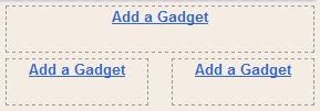
Now go to Design > Page Elements and check for your newly added two
small sidebars below you main sidebar.
Add Three Columns in Footer to Blogger
Keeping you sidebars clean makes your blog look good. This is where the
role of the columns in footer section comes in. Also it will give your
blog a new style. For example, see at the bottom of my blog. This simple
tutorial will explain how to do create and add three sidebar columns to
footer section in Blogger templates.

1. Go to Design > Edit HTML and first backup your template.
2. Move your gadgets/widgets (if any) from the footer section to your sidebar.
3. Find the closing "]]></b:skin>" tag and immediately before this line, add the following styling definitions and properties:
#footer-left {
width: 33%;
float: left;
margin:5px;
text-align: left;
}
#footer-center {
width: 34%;
float: left;
margin:5px;
text-align: center;
}
#footer-right {
width: 33%;
float: right;
margin:5px;
text-align: right;
}
#footer-column-container {
clear:both;
}
.footer-column {
padding:5px;
}
3. Find the codes:
<div id='footer-wrapper'>
<b:section class='footer' id='footer'/>
</div>
And replace this section with the below codes to add three widget sections to blogger footer:
<div id='footer-wrapper'>
<div id='footer-column-container'>
<div id='footer-left'>
<b:section class='footer-column' id='col1' preferred='yes' style='float:left;'/>
</div>
<div id='footer-center'>
<b:section class='footer-column' id='col2' preferred='yes' style='float:left;'/>
</div>
<div id='footer-right'>
<b:section class='footer-column' id='col3' preferred='yes' style='float:right;'/>
</div>
<div style='clear:both;'/>
</div>
</div>
5. Preview for any error and save it. Go to Design > Page Elements, you will find out that you have added three columns in Blogger footer section.
Now move and add some of the widgets there and see how it looks.
How to Create Three Column Blogger Template
You must have seen many blogs having three columns. You may also want
to make your own three column Blogger Layout Template and give your
blog a new level in style. So let's do it with a simple tutorial.
You can see in Design > Page elements that you already have two column, one for the main body and the other is the sidebar. So you need to create and add an extra sidebar column.

1. Go to Design > Edit Template and backup your template.
2. Find:
4. Find and change the width of the outer-wrapper to 900px or more to avoid overlapping of sidebar over the main-wrapper.
7. Find the section:
You can see in Design > Page elements that you already have two column, one for the main body and the other is the sidebar. So you need to create and add an extra sidebar column.
Adding the Third Sidebar Column in Blogger Template
1. Go to Design > Edit Template and backup your template.
2. Find:
#sidebar-wrapper {
width: 220px;
float: $endSide;
word-wrap: break-word; /* fix for long text breaking sidebar float in IE */
overflow: hidden;     /* fix for long non-text content breaking IE sidebar float */
}
And change float to:
float: right;
3. Below it add:
#left-sidebar-wrap {
width: 220px;
float: left;
word-wrap: break-word;
overflow: hidden;
}
This "float: left" will make the sidebar float to left. Thus you will be having a sidebar to the left of your blogger template.
4. Find and change the width of the outer-wrapper to 900px or more to avoid overlapping of sidebar over the main-wrapper.
#outer-wrapper {
width: 660px;
margin:0 auto;
padding:10px;
text-align:$startSide;
font: $bodyfont;
}
5. Find #main-wrapper and replace it with:
#main-wrapper {
width: 410px;
float: left;
margin:0 20px;
word-wrap: break-word; /* fix for long text breaking sidebar float in IE */
overflow: hidden; /* fix for long non-text content breaking IE sidebar float */
}
Here a margin to left and right of 20px is added to avoid
overlapping of sidebars with the main wrapper. You can change it
accordingly to overcome the issue of overlapping of sidebars.
7. Find the section:
<div id='main-wrapper'>
And just before this add:
<div id='left-sidebar-wrap'>
<b:section class='sidebar' id='left-sidebar' preferred='yes'/>
</div>
8. Save your template and "Wallah", its done. You have created an extra sidebar
for your Blogger template.
Now you have to do some adjustments yourselves. Adjust the widths by
altering the pixels (px) of the "outer-wrapper", "main-wrapper",
"sidebar-wrapper" and "left-sidebar-wrap". Adjust the margins, paddings
and width by same way to "header-wrapper" and "footer-wrapper" to match
the style.
Subscribe to:
Posts (Atom)
